26 February 2024

Work from last year

Here it is. I've been wanting to get these up, but it's been a busy year. Not much of an excuse, I know, but I have two overload classes this semester and everything seems like it takes longer and my days go later and later. It looks like I didn't do much work last year and I guess it's less than the usual. I did do a lot of product design imagery and animation, but I can't really show that yet. I did some personal work that came out nicely, though.

This piece isn't really finished. At the moment, it's just a simple 3D model that I was working on for a larger project. It still needs to be textured and fit into the final setting. I'll do that someday, but the project stalled. That happens a lot, at least for the kinds of things I am on. It will probably start up and get done later this year. Hopefully, it will show up in my next end-of-year post.

Here's a drawing from my summer Life Drawing class. I try to have a long pose at the end of each drawing session. This is a great model I've been working with and we came up with a fun pose using some interesting props. The basket is hers. I was quite happy with it and the end result. Some drawings work out and some don't, particularly working from a live model. That's always a challenge, at least for me. As you might guess, it's easier to work from a photo for many reasons. I like the very classical look we got here. The basket was just a fun afterthought. I've been trying to come up with a clever name for this drawing, but I haven't thought of anything good yet.

Here's another drawing of that same model. This was during the same summer session and it's our long pose again. She always brings interesting props or clothing articles to use. Sometimes I like to work a little larger and do more of a portrait than the entire figure. I was pleased with this one as well and it's fun to throw in a bit of color with the charcoal. Some combinations of the pose with the lighting work out well.


A different model from the same summer session. This was the first time I had worked with this model and it was a good experience. I like to add as many models to my roster as I can and hope that they are all good and work out. For the most part, that has been pretty successful and I get models that I work with on a regular basis in my classes. I did this one with Nupastel, which is very similar to charcoal. It's fun to try and add some color in. She had some bright pink hair color that I tried to replicate, but I couldn't quite catch it. I emphasized the rimlighting on the left a bit more than was there, but I think it works. This image is a good example of how value can work no matter what the colors are.

Here's another commercial piece, but I don't think it was ever finished. It's really a weird idea; this company was doing something with a cornhole competition and wanted their own graphic for the cornhole board. That's what the dark circle in the middle is: the hole for the bag (?) to go in. I ended up doing several designs. I'm not sure which one is the best, but I kind of like this one. In the end, the company decided not to do this at all, after all the work I did. I suppose I just couldn't make a bad idea work well enough.


This is another personal drawing. I like to do these just to keep my drawing skills up. It's not from life, so I can take my time and get all the details I need to. I liked this image and felt it was a beautiful pose. There was also some interesting texture that I tried to capture. I made some changes to the flowers in her hair and felt it would be a nice place to add some color. It's not without its flaws, but overall, I do like this one.


Another of the same sort of thing. It's actually the same model. I liked this pose and enjoyed some of the challenges in the angles and cast shadows. As with a lot of these, I'm trying to add in some color in interesting ways. For this image, I chose the rustic wooden beam she's leaning on. The problem is that it's grey, so how do I make that stand out? I'm using grey Nupastel, but it has a lot of other colors in there as well. Nothing in life is purely without color. I'm pleased with this drawing. I spent a lot of time on it, but that's the luxury you have when you work with photos.

This is a personal piece. It's a digital painting. I had been working on it for a long time, mainly during my classes as a demonstration piece. I started on it long before last year, but it sat around on class computers without much progress happening. I finally finished it off to show my classes how I would paint a portrait digitally. In my Digital Illustration class, I have a portrait assignment that I give my students, so I like showing them one approach they can take. If this image looks familiar to anyone, I based it off of a couple of photos by the Bangladeshi photographer Mou Aysha, who has made some beautiful photos like this. I started with one that I found quite striking, but then added details from another. For me, painting children can be difficult, but I like how this one came out.

This was one I had in mind for a while. My plan was to do it as a Christmas present for my son. It's an F-35, his favorite plane, so I thought he would like it as a gift. The plane was not too hard, but painting the background took a while. I do like this one a lot. I had it printed out and mounted, but I had to do that a couple of times before they got it right. I've made some tutorials documenting the techniques I used to create this. You can start watching them here.

29 June 2023

Work I forgot

 I like to put up my work for each year when it's over, but for some reason, I forgot a big chunk of work that I did last summer. I'm not sure why I didn't think to include them, but here they are. They were all done by a company in California that provides digital backdrops for theatrical productions. They were interested in using my work, but wanted me to do some test images first. I don't necessarily recommend this, but they did pay a bit for them and I was interested in this project.

The first test image was basically, a haunted house on a steep hill. They sent me a rough concept image to work from and this is what I ended up with, after a bit of art direction from them. As you can tell, it's mostly photo-based, so it's sort of a matte painting. I liked the end result quite a bit, so I decided to animate it. You can find a link to that animation here

Here is the second test image they wanted. Again, I was given a concept image to work from. I do like this. It's okay, but not the greatest thing I've done. It's not totally photorealistic and not quite an illustration, but the overall impression is cool.

They ended up liking them, so I was given the full project: create digital backdrops for the musical The Prom. It was a challenging job, since they wanted images at a really large pixel size. This one was interesting. It's an image of the Shubert Theater with a fictional production called Eleanor! I guess that's sort of an in joke for the musical. This is a day-for-night shot and I had to create all the signage, since this musical doesn't actually exist. The idea here is that this is what it would look like if it was actually a show on Broadway. I used this image for a tutorial I did on refining mask edges in Photoshop. You can watch it here.

After the 'show' wraps, the cast meets at Sardi's for their party. This is an actual restaurant in New York City that is popular among the theater crowd. This image is based on images of the restaurant, but customized to be a backdrop. The main feature of the restaurant is the caricatures of famous personalities framed and hangin on the walls and columns all around. Can you tell who is on the front right column?

Much of the musical takes place in a fictional high school. This is my image for the exterior. If the color here looks a bit off, they had a color scheme for the production that they wanted me to match. I had a hard time figuring out what they wanted. My initial images were more plain and realistic.

Here is an interior shot. James Madison Hight School has the Wildcats as its mascot and the colors are blue and gold, so that imagery pops up over and over. I thought this image turn out nice. I like working with different surface quality and reflections, so I had fun on this one. It has a dramatic impact as well.

The theater troupe from New York comes to this midwest town, so they need to stay at a motel. Here is an exterior shot where they stayed. I also had to to a daytime shot, but this one looks cooler. It's supposed to be a cheap, plain motel that wouldn't really be that fun to stay in, so that's what I tried. 

The interior lobby shot was also supposed to hammer that point home. It's small, drab, and maybe a bit depressing. That's what I was supposed to do. It's sometimes hard to make conflicting ideas work together in one image; I still want to make a cool piece of artwork. I still kinda like this one.

For this final image, I went all out. It's for the final scene, where the theater troupe helps put on a fancy prom for the kids. It's still in the gym, so I worked on top of that image, but it was also supposed to look fancy and spectacular. This was in addition to a 'sad prom' image that was earlier in the show. I actually created quite a few backgrounds for this production. These images here are some of my favorites. It was a really big job and ended up being more work and time than I had thought at first, but it was an interesting job. It was a nice summer job and I had to learn a lot. Creating theatrical backdrops is different than other kinds of images, as the viewpoint and scale have to serve a particular need. It was tough at first, but I eventually figured it out.

01 February 2023

Tenure!

 It has finally happened. After my first year as a lecturer, I went on tenure track at UNG. At three years, I went through a pre-tenure review and was supposed to do my tenure review after five years, or so I though. Actually, it was during my fifth year, right at the beginning. That was early September of last year and I've been waiting for an answer ever since. Recently, I was notified by the board that decides these things that they have recommended me for tenure and promotion to associate professor to the university president. I just got the letter back from the president, who has to sign off on these things, officially congratulating me. The tenure and promotion start in the fall, the start of the next academic year. So all that work and stress paid off. 

09 January 2023

Last year's work

It's finally time to take a look and see what I accomplished in the previous year. As it stacks up, it doesn't seem like a lot, but I did a lot of image prep, production, and video work that doesn't show well for an illustration blog. I also did a lot of work on product development that I can't quite show yet and I have some personal work that's still in progress. But here's what I have done.

Okay, so it's not very exciting, but this is a frame from an animation showing another ground cutaway. In this case, the machinery is rendered, but instead of a realistic background, a schematic of the different soil types is shown. This was partially a stylistic decision and partly to keep the cost down.

I guess this one is my big illustration of the year. As usual, it's showing geotechnical onsite applications. This one was for an anniversary publication for this company. The problem here is that I had to cram a whole bunch of different applications into one image. This one needed a dam with a lake in the background, windmills in the distance, a bridge, sheet piling along a road, rock anchors on a cliff face across the river, a shotcrete wall with soil anchors, and measuring equipment in the foreground. It's obvious that no one image could ever include all of this in reality, so I have to try and fit it in as best I can. I did what I could. It won't win any awards, but it does what it needs to and the client liked it. I like specific areas of it. For example, I like how the dam turned out. The guy and testing equipment near the bottom look pretty good as well, but the whole thing just doesn't come together. In this case, the whole is definitely not greater than the sum of its parts.

Here's a screenshot from another animation. I was working on some of these for a long time, not because they took so long to do, but because there were pauses in the process and it took the client a long time go make decisions and answer questions. There was government funding somewhere along the way and that just makes things much more complicated. This one shows a seismic process where these hammers and devices are put down boreholes to measure soil density or something. I just remember it took a long time to get our questions answered about what they actually did and how to depict it.

Once again, I taught Life Drawing over the summer. In addition to teaching, my responsibility has also come to include keeping a roster of models current and finding new ones to replenish our list. I worked with some new models this time and they did great. This is one of our new models. She was fun and exciting to work with. This is a sketch I did in class with the students. Like all drawings from life, it's a bit rough as I'm trying to put a lot into a limited time. Often, I'm trying to get the likeness correct, but I'm working hard and fast to do so. These are just simple charcoal drawings done on newsprint.

Another new model for our class. I always try to end each session on a long pose, at least an hour, sometimes a bit more. That's actually not very long (for me anyway) to try and get in a full figure or a good likeness of someone. I think this one turned out fairly well. For these longer poses, I try to get a good lighting setup and find an interesting angle.


This is a model I've worked with for a number of years now. He's always been great. This one is just a quick sketch, but I liked how it turned out. The students were surprised at how much it looked like him. A likeness can be accomplished with very little drawn on the paper. As you can see, the figure is only briefly roughed in and I spent most of my short time on the face. This one is still on newsprint, but it's done with Nupastel for a bit of color. It's nice to mix it up once in a while.


Here's one that might resemble something from the previous year. That's because I started on it back then. I had been working on this one and then paused for quite a while for the client to figure stuff out. I was finally able to get back to it and finish it up. I had to solve some issues to get this final result to work. Real 3D artists might scoff at this and they're probably right. I'm not great with my 3D work, but I do what I can. For each project, especially animation, I try to learn one new tool or technique that I hadn't used before. This one isn't great, but I do kind of like it.

Another big illustration to end out the year. If you recognize part of this as something I've done before, you would be right. With my primary client, we often reuse artwork to save cost for the final end client. I had illustrated the bottom rig before and we used it as the base of this illustration for a large exhibit. The other two pieces of machinery were illustrated anew for this project. It was tough to fit everything together, bit I came up with something that worked. This was the central panel in a three-piece exhibit. It was quite big; exhibit graphics are usually six to eight feel tall. The dark parts at the top and bottom are essentially bleeds. Those sections roll up into the hardware that holds the whole thing up.


And finally, a personal piece. I like to keep up with my traditional drawing just to make sure I can still do it. If I can improve any along the way, that's a bonus. Since I teach this kind of work over the summer, I like to make sure that I'm able to do what I expect my students to do. This was a concept I had for a while. The last element I needed was a skull, so I used one that we have in our drawing studio at the university. They aren't real, but they are realistic. My idea was to add some color to make it stand out, but how do you do bone in a black and white drawing? I did an Internet search for real human skulls to get an idea of what the color should be and used Nupastel for it to contrast with the rest of the drawing, which is charcoal and white Conté crayon. This image is my take on the theme of Death and the Maiden. What you mostly see is death in a position of power, often seducing the weak or innocent young women. In my version, the maiden has the upper hand, as she is contemplating and even smiling at Death, symbolized by the skull. I spent a long time on this one and I'm quite pleased with the result.

So that's what I have for 2022. I had hoped to have more professional illustration work, but that's how it is. I'm trying to get more side work, but it's hard to predict. Teaching and all the associated duties, especially as I work toward tenure, does take a lot of time.

15 September 2022

Applying for tenure

 This one really snuck up on me. After five years on tenure track, it is time to submit my final portfolio for consideration. Based on when I started, I thought I still had more time, but it was mentioned at our department meeting that my deadline was coming up. It's good I was told then, because I had no idea. But I collected all my info to format and get ready. This includes documentation to show my accomplishments in teaching, service, and research. I got everything in on time (barely) and now it's just a waiting game. I wonder how long it will take for the decision to be reached.

06 April 2022

Some current work

What have I been up to? Well, there's always something. Recently, I finished another illustration. This was a big, complicated one. It was hard for me because of all the complicated parts and construction settings I had to include in a limited area. I took longer on it that I had planned initially. It came out better than I was hoping for a while. But if the client is okay with it, that's the important thing, right. The agency I did it for put up a movie showing how the image progressed from early sketch to the end result. You can see it here. 


28 January 2022

My work from 2021

It's a bit late, but I thought I should put up work from last year. I don't know that there's much good work, but here's what I have. As always, I did additional work that isn't ready to show in a public forum for one reason or another.

Is this an illustration? Maybe not, as it's mainly a photo. It might not be very exciting, but you do what you have to do. My job was really to create text that looked like it was in the ground, more or less. It had to match the perspective of the photo and I tried different versions to see what would work. I don't know if this does, but it's what eventually got chosen.

This one probably isn't exciting, either. It's a 3D model I had to build for an animation I was working on. I say 'was working,' because I still haven't finished it. It's not for my lack of effort, but it's still being reviewed by the end client. Sometimes, projects can take a long time, depending on how much red tape companies have to go through. For what it is, I guess this little model came out okay.

Here's a shot from that same animation. These little items are geophones that are strung together and planted in the ground. You may notice a similar ground cutaway to other work I posted from the previous year. They are sort of part of a series. I like how this one was turning out, so I hope to finish it someday.

I've been doing a little work for OUR, Operation Underground Railroad that is an organization seeking to free sex slaves in a crime commonly called 'human trafficking.' This was for a digital billboard. It's nothing much, just a bit of image editing with some typography. It's what they were looking for, so I do what I can. Hopefully, I'll get the chance to create more promotional materials for them in the future.

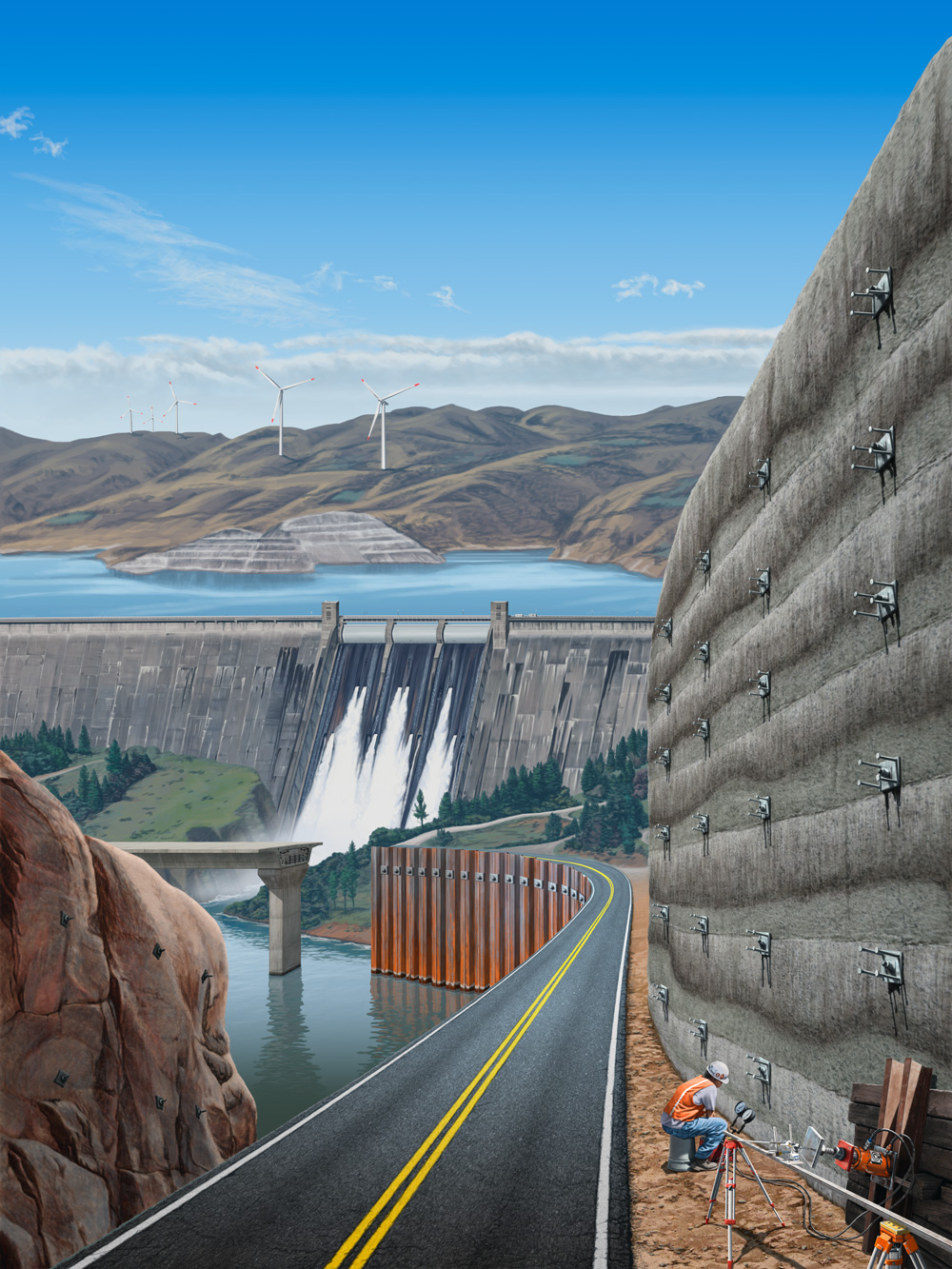
Here's an actual illustration, finally. It's pretty good and I've done something like this before. It won't win any awards, but I tried to do something cool with it. The important part is just the little patches along the runway. As long the client is happy, that's what counts, right? 


Here's another frame from a 3D animation. This one also is still in progress and I'm waiting for approval so I can continue. I didn't build this bit seen here in the upper left; I just organized it for animation and textured it to fit along with the rest of the scene. Yes, it's another ground cutaway.

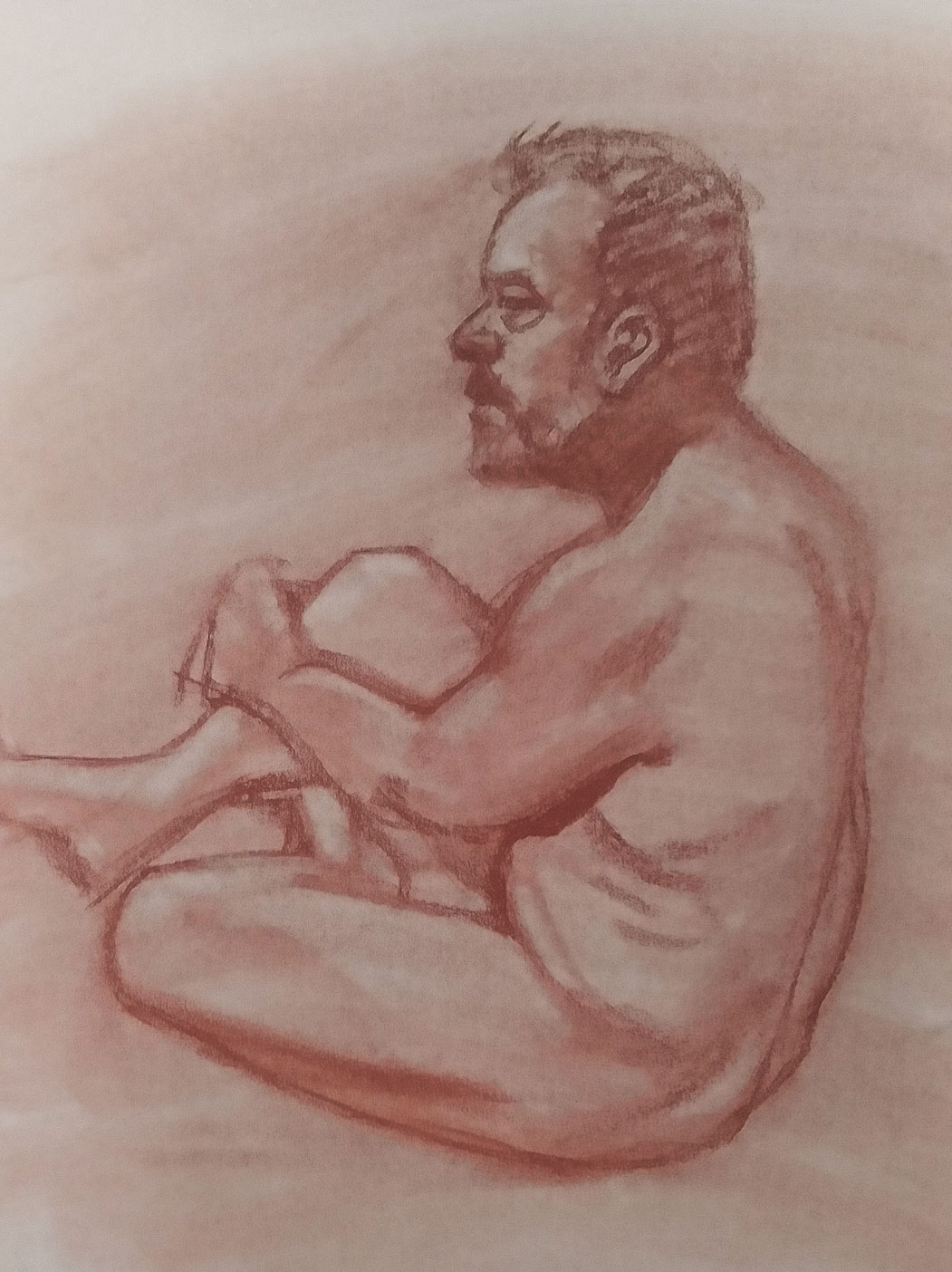
I taught Life Drawing again this summer, which was nice to do again, since I didn't have it last summer. I hadn't done this kind of drawing for a while, so I wanted to give it a try and make sure I could still do it. I did some practice charcoal drawings before I returned to the classroom. Here is one of the first ones I did. Sorry if this might be NSFW, but it's art. I ended up doing quite a few, as it was fun to do some traditional drawing again. I still try to be classy. This one is currently in our faculty show we are having at UNG.


After a few black and white drawings, I wanted to try and add some color, but in a fun way. I didn't want to do full-on color, but I liked the idea of looking for source material that had an interesting splash of color where I could work with pastels. These are all just on newsprint, so they aren't great works of art that will last for posterity. They are just fun little exercises. After drawing the the red coat, I hesitated for a while on the idea of adding some red as reflected light on the figure. Unlike with digital art, there's no going back once a decision like this is made. Luckily, I liked how it turned out and looked for more ways I could implement this technique in future drawings.

Here's another one. I did this drawing with the idea of recording my work so I could turn it into a tutorial. I've done a lot of digital art tutorials, so I thought I should try some traditional art. Unfortunately, I didn't realize how much video my camera would record in one take, so I lost a bit, but I did realize how to do this and pulled it together in the end. In addition to the tutorial videos, I made a time-lapse one so you could see the drawing come together (except the part I didn't record) in just a few minutes. You can see it here. Sorry if the music isn't great. I had something cooler that was a good duration. It was an instrumental piece and the music publisher is in Germany. But a day or two after I uploaded it to YouTube, I got a copyright infringement notice from them. Weird. 

Yet another one. I did say that I ended up doing quite a few this year; this is just a small selection. You can see a lot more of them in my gallery on Deviant Art. This one is a bit different. I kind of like it, especially the contrast between the natural curves of the figure and the hard, artificial edges of the chair. After the other tutorials, I had a request to do one based on drawing the face, so I recorded that while I was working on this drawing. A figure drawing isn't the same thing as a portrait, so getting the likeness right isn't the prime concern. The face looks good here, but it doesn't exactly look like the model. I'm only a little bit disappointed.


This is the last one. I was quite pleased with this drawing as I went back to my idea of adding a shot of color. The thin, diaphanous fabric was a challenge, but in the end I was able to pull it off. I spent a lot of time on this one, trying to get all the anatomy correct. I do like the hints of orange reflecting back on the skin and think it works well to pull everything together. As it was not the full figure, I worked a bit larger and could put a good bit of detail in the face; this one is pretty much a portrait.


My last professional illustration of the year. This one isn't much to look at and it changed quite a bit from the process of going from comp to final. For what it is, it looks pretty good, but I was disappointed in what I ended up with based on the client's request. Earlier versions were more interesting visually, but with commercial work, that's not the most important point.